Soluna
Brand Identity & Strategy Development
A grounded brand identity system designed to help overwhelmed women create calm, flexible structure in their lives without relying on rigid systems or spiritual cliché.
The Challenge
The client arrived with a strong emotional goal but without a clear identity direction. While she knew she wanted to help overwhelmed women create structure in their lives in a way that felt calm, flexible, and sustainable, she struggled to define how the brand itself should communicate that experience.
Despite the symbolic nature of the name Soluna (Sol = Sun, Luna = Moon), the client specifically wanted to avoid spiritual clichés or overly literal symbolism within the visual identity.
In addition, the client was uncertain about what products and systems she could realistically offer customers, making it difficult to establish a clear brand ecosystem or personality direction.
The Problem
The client had conflicting goals throughout the discovery phase.
She wanted to create a spiritual brand without allowing the visuals to feel “too spiritual,” while simultaneously wanting the identity to stand out in a memorable way.
However, many of the client's personal visual preferences leaned toward extremely safe minimalism, putting the brand at risk of becoming visually bland or emotionally forgettable.
There was also a lack of cohesion between the name, tone, and visual direction, leaving the project without a clear anchor or consistent personality system.
The Strategy
The first step was reframing the brand as structured systems for intentional living, while ensuring the systems themselves still felt flexible enough that customers would not feel boxed into rigid routines or expectations.
The second step was shifting away from literal symbolism and toward conceptual expression so the identity could feel emotionally aligned with the brand without becoming visually predictable.
The third step was introducing balance between grounded and expressive, and minimal and memorable.
Through this process, I identified the need for a strong visual anchor that felt calm and refined while still creating enough distinction to support long-term customer recognition.
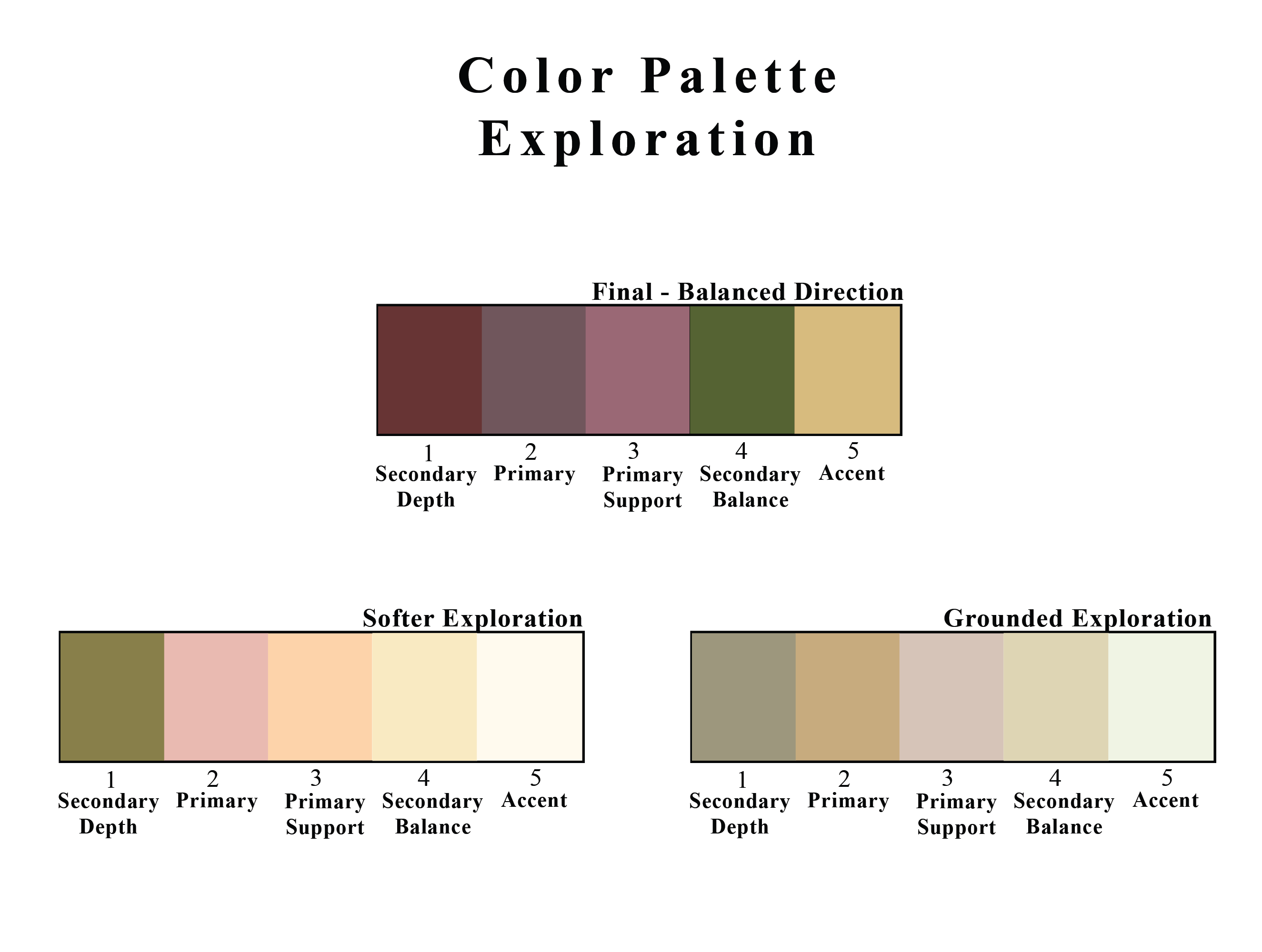
The Solution
The color palette was refined through controlled tonal exploration, balancing softness and depth to create a direction that felt calm, intentional, and emotionally grounded without becoming lifeless.
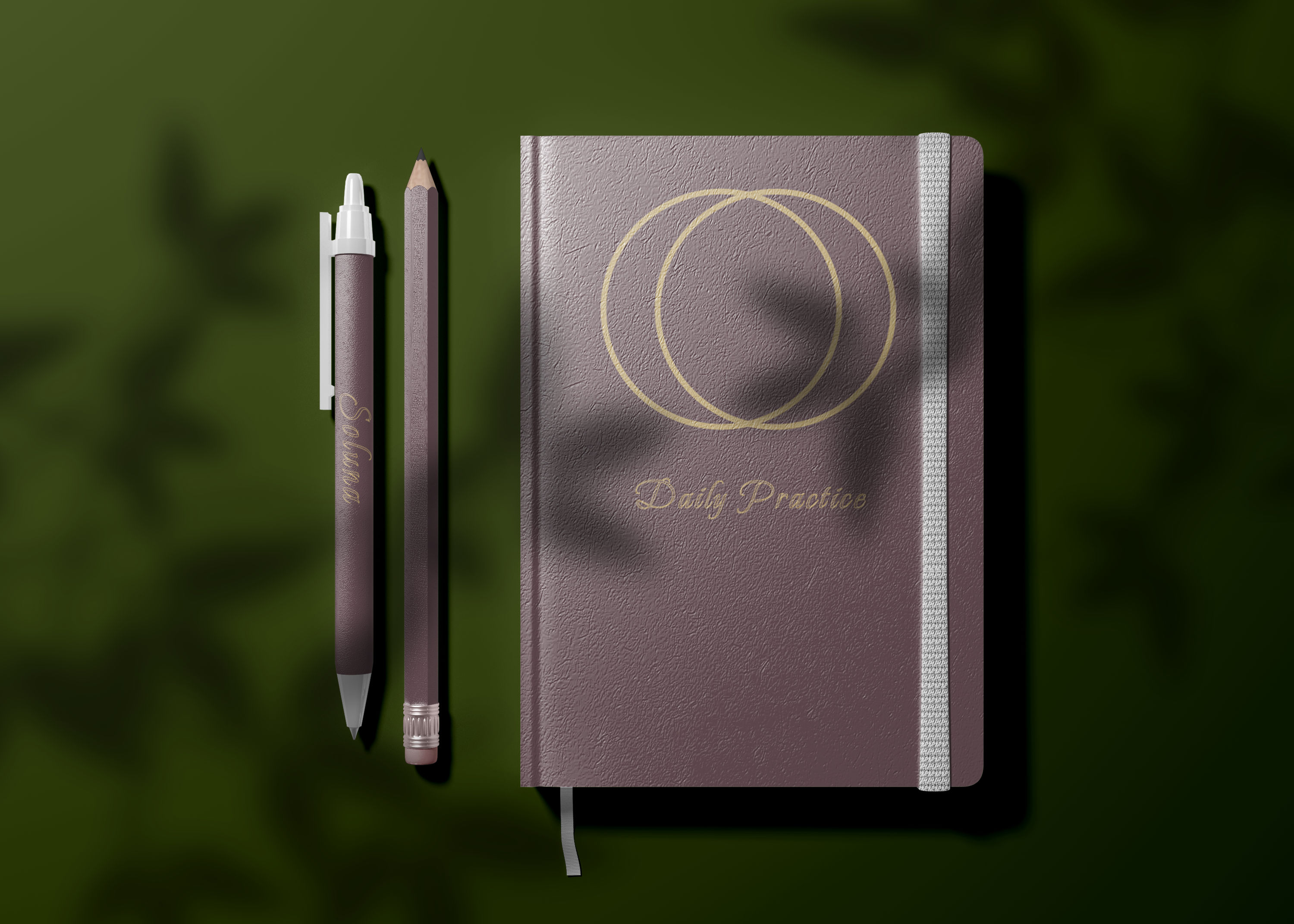
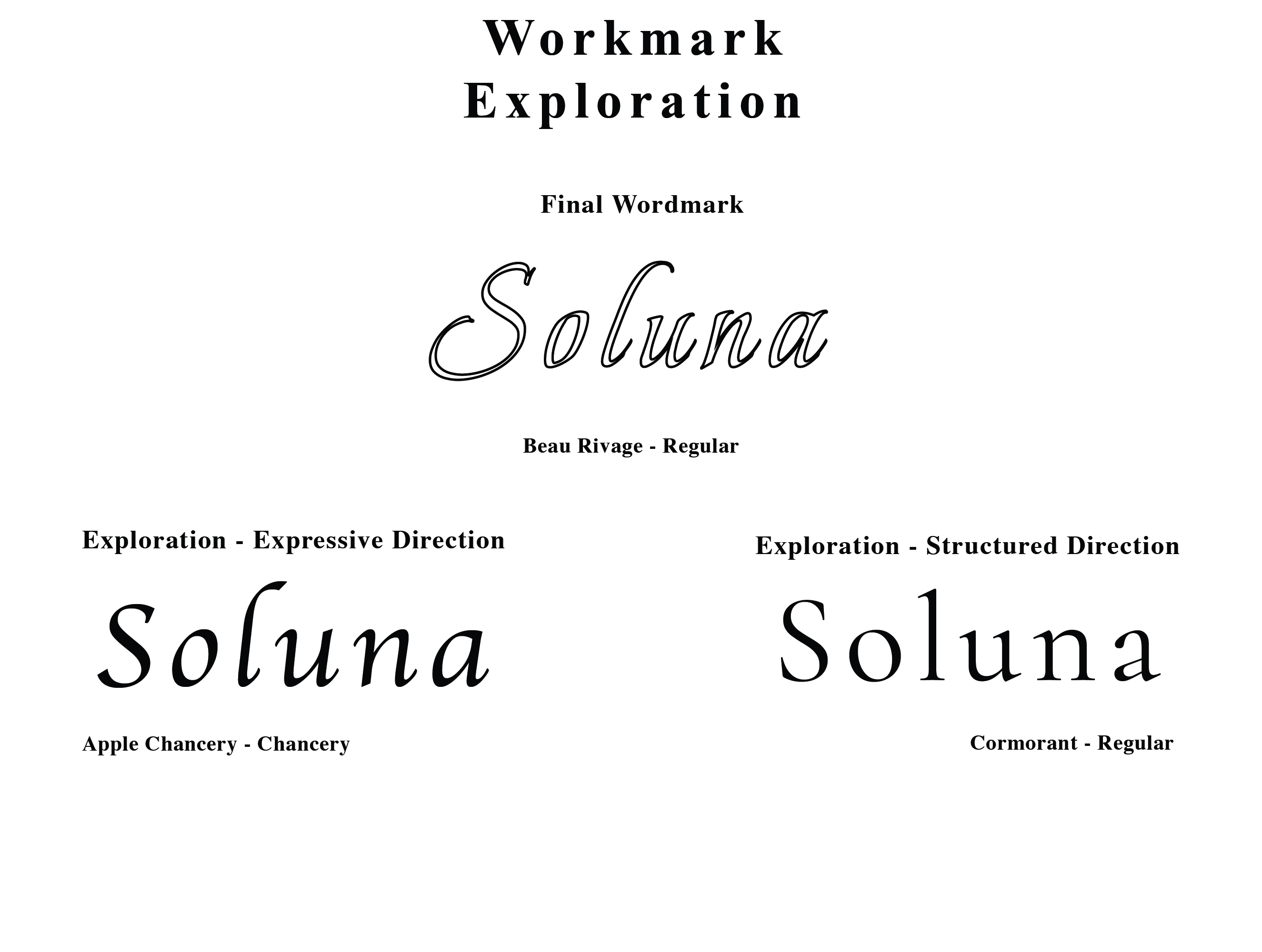
I developed a wordmark direction that introduced expressive elegance while maintaining enough structure and stability to support the brand's long-term positioning.
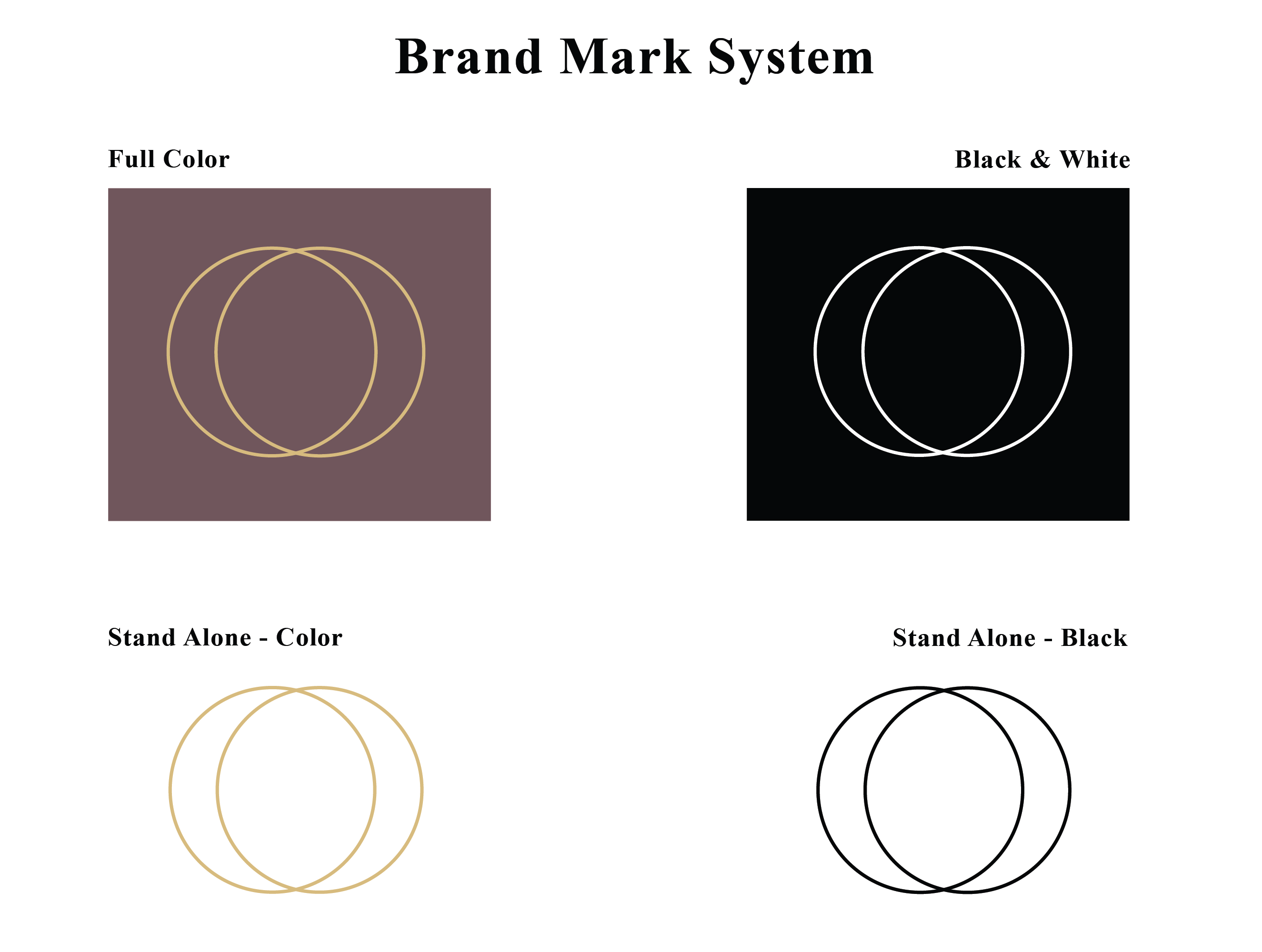
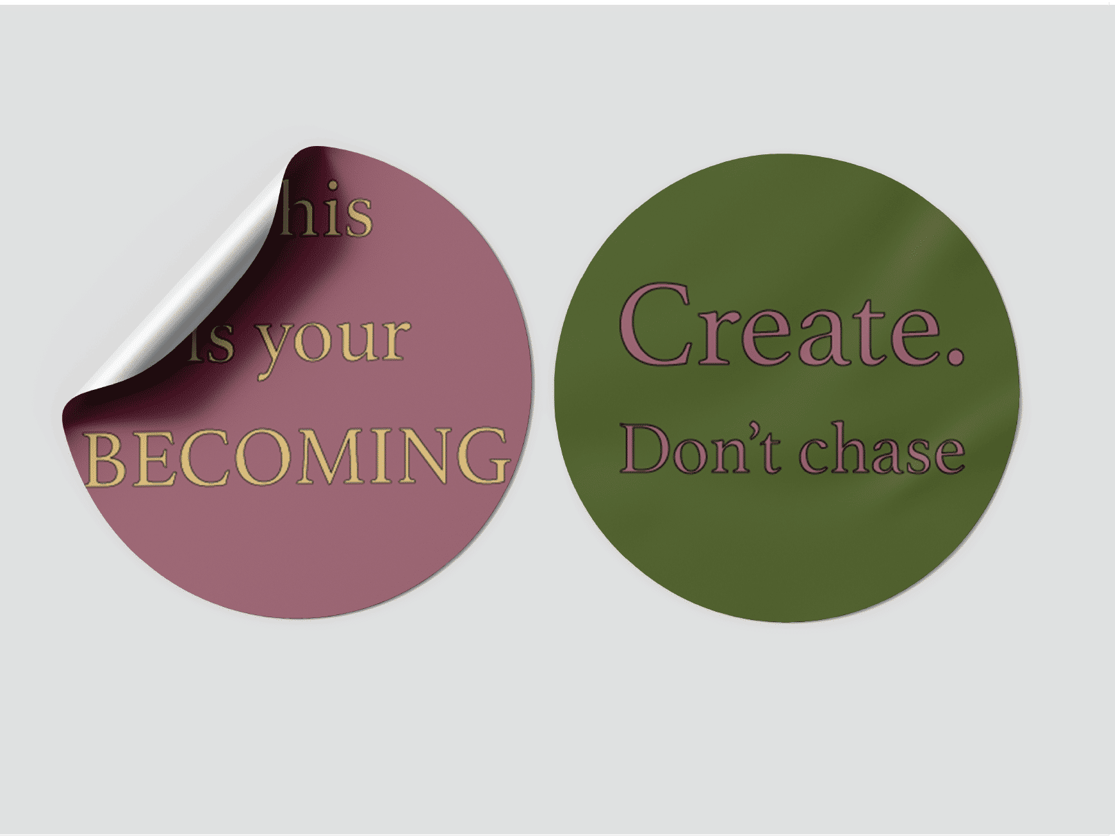
The logo system centered around a minimal abstract mark designed to represent balance and duality without relying on literal sun and moon imagery.
Rather than exploring multiple overly complex directions, the symbol was intentionally reduced to its simplest form, focusing on repetition, overlap, and negative space to create something open to interpretation while still feeling meaningful and intentional.
During the process, I also introduced a stronger identity direction after discussing the branding consequences of designing for a “safe middle,” helping the client understand that broad appeal without personality often weakens long-term brand recognition.
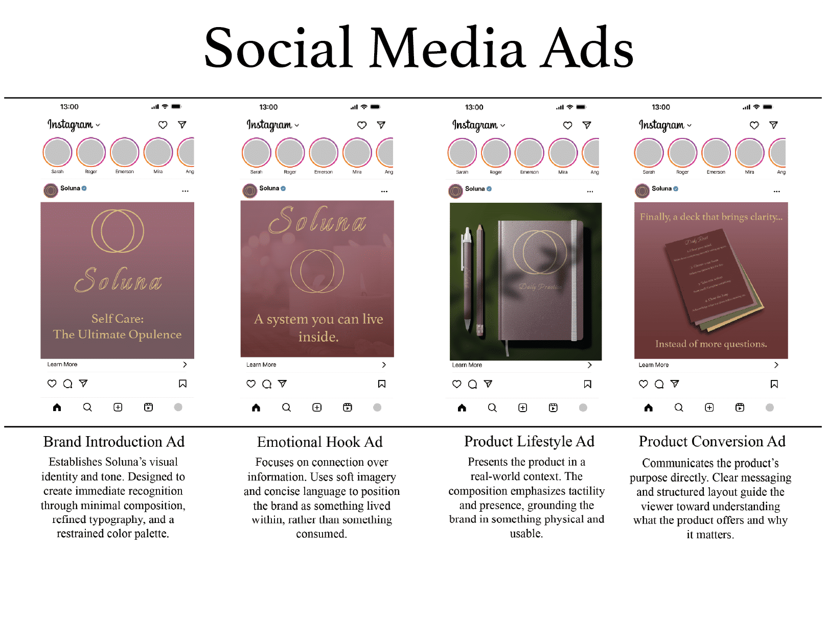
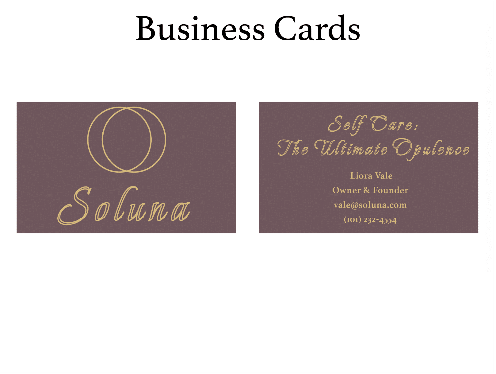
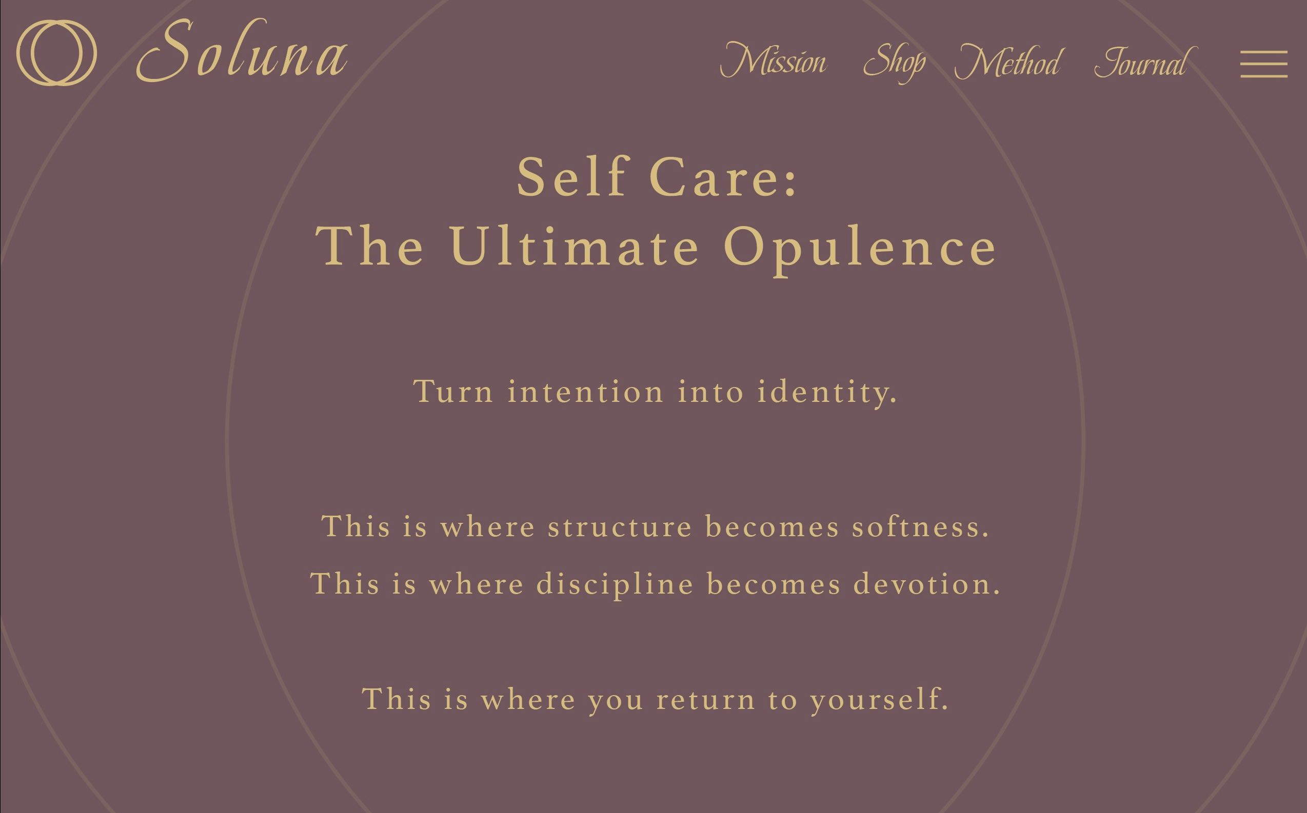
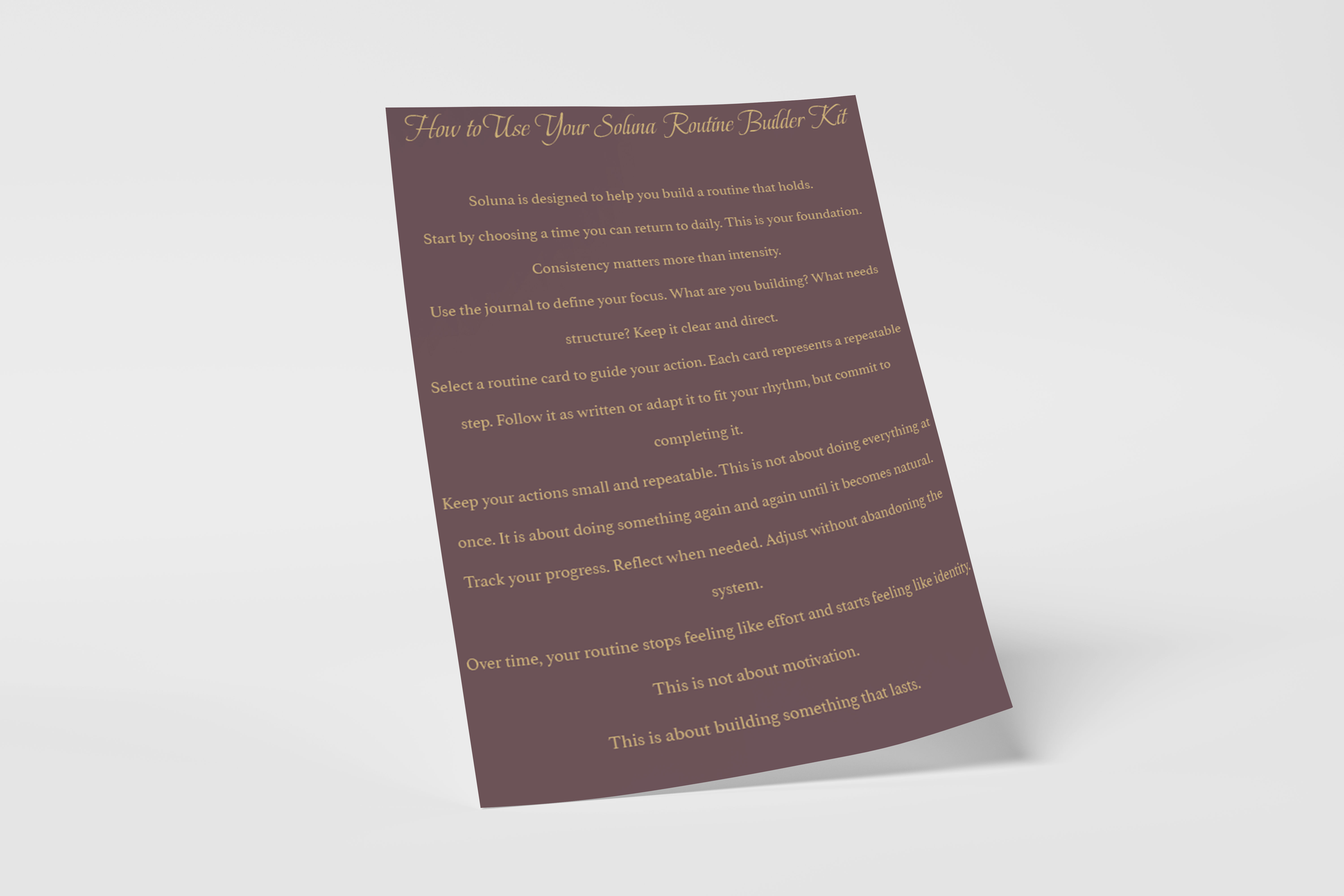
Brand Applications
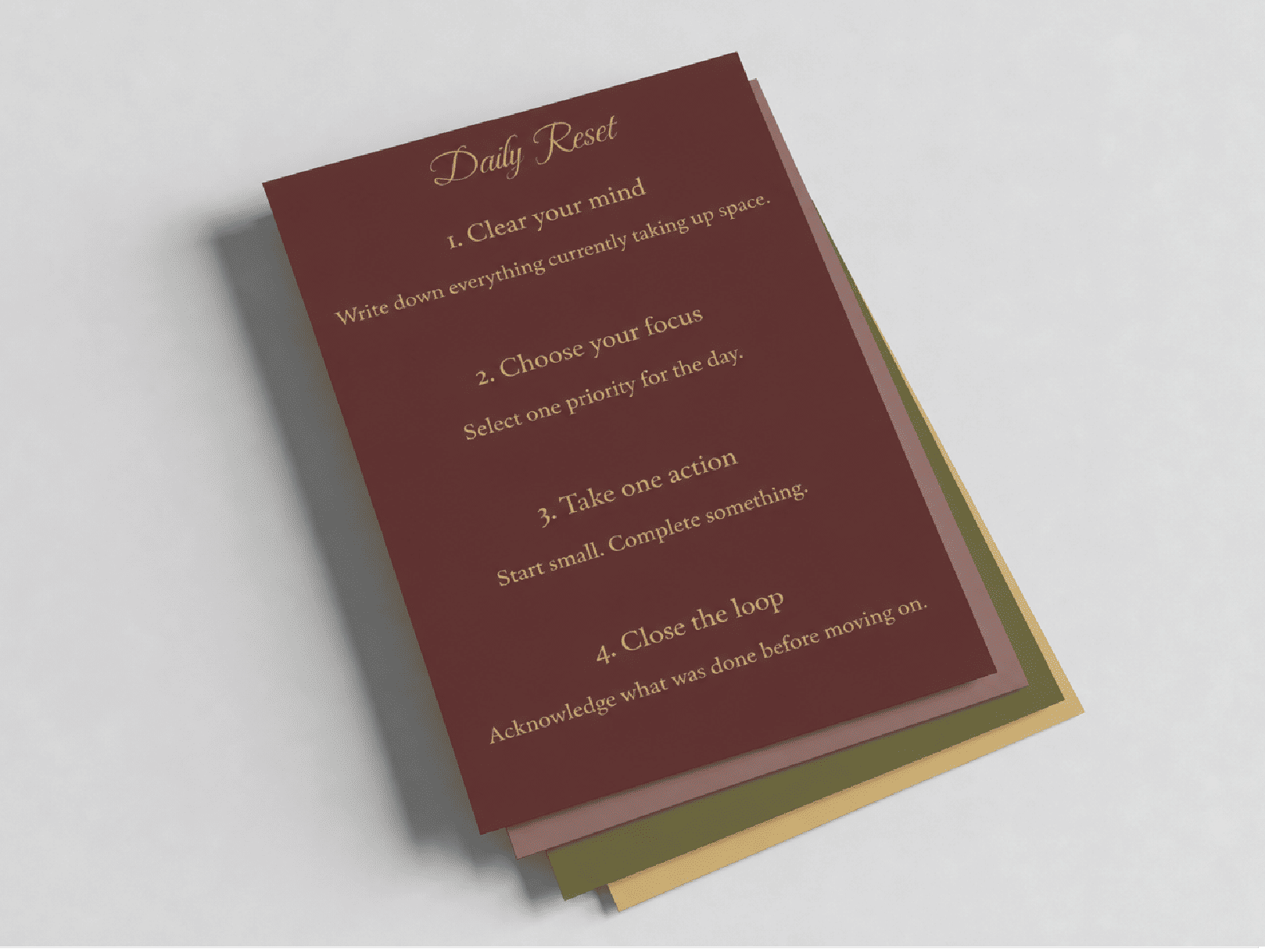
The Soluna identity system was applied across multiple conceptual brand touchpoints to demonstrate scalability and future expansion potential.
Applications included an intention journal system, homepage website direction, and packaging concepts designed to help the client visualize the broader ecosystem of products the brand could eventually support.
The Outcome
Soluna now has a clear and memorable identity direction where the visual system reflects balance without falling into cliché.
The brand feels grounded yet expressive, and the identity system is positioned to support future expansion into a larger product ecosystem.